Jessica produced a very nice book in Microsoft Word. If you’re going straight to epub, you can just upload it at Amazon KDP and they’ll do a lot of the work. We’ll cover that in the next part. For now I’ll summarize how we created a print-ready version of Sidetrack Key.
We’re assuming the document has been edited within an inch of its life already. Sidetrack Key has had a developmental edit, a line edit, and finally the pre-publication edit by me. I’m not an Editor. I’m an OCD/ADD computer nerd. This is my secret weapon.
Print and Epub are not the same. The epub version has no headers or footers, the front matter is literally different (and a different ISBN for that matter, if any), allows active links to other sites on the Internet, and has somewhat funky support for fonts and specialized graphics like chapter headings and dropcaps.
The print version is essentially a PDF. What you see is what you get.
Now, if you want a print version that appears professional, i.e. indistinguishable from a book from a traditional publisher, what should you pay attention to?
- The cover – covered in Part 1 – it shouldn’t look like a self-published book.
- Size, font and paragraph spacing – Choosing a good looking font and making sure it’s legible.
- The front matter – All the stuff in the front of the book. I’ll list it in detail.
- Page numbering – Starts after the front matter.
- Chapters, etc all start on the right-hand page (they’re odd-numbered)
- Headers – Right and Left page headers are different. No headers on Chapter title pages.
- Attention to detail – All headers, page numbers and chapter headings are in the same place
You’re going to end up with 2 different book masters. One for print, the other for epub.
Part of accepting this reality is that there will now be multiple master documents floating around. They’ll be changing, some changes will need discussions, so workflow becomes an issue.
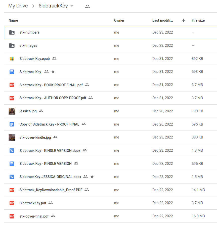
I immediately uploaded Jessica’s manuscript into Google Docs. Created a new folder in Google Drive called ‘sidetrack’ and shared it with her. That’s 90% of the workflow, right there. This is what that google drive folder looks like:
The Size, Font and Character Spacing
We ended up using Cambria 12 point, single spaced. We also ended up choosing 6×9 as the book size. But ran into a snag. Google Docs doesn’t allow you to set a page size. I suspect if you did this just in Word, you wouldn’t have this problem. The solution is to downlad an extension called “Page Sizer” – use it to size your pages, then turn it off, you’ll only need this once.
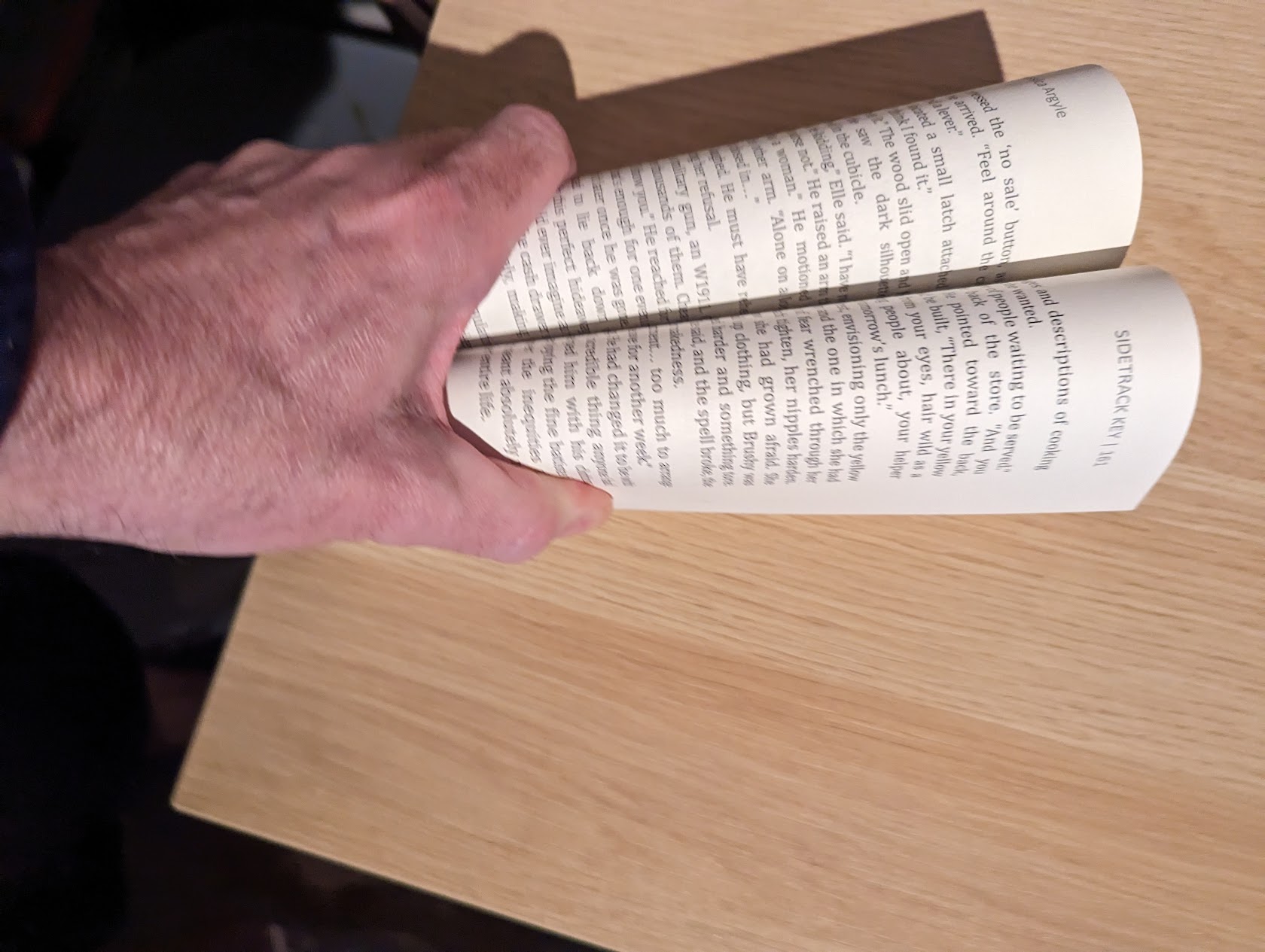
The headers. Our even-page headers (the left-side) had the page number and author name, odd-page headers (the right side) had the book name in all caps and the page number, like so:
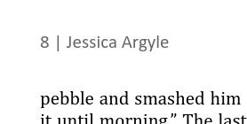
They’re the same size as the text, but printed in grey so they’re set back from the text.
The Front Matter
This is probably the easiest way to spot a self-published book after the cover. Open it up. Until I looked at a pile of books, I had absolutely no idea about the arcane “front matter”. I’m sure there were excellent reasons for this in the early 1900’s… in any case, here we go:
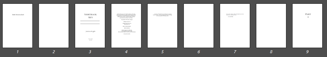
There it is. 8 pages before we hit actual content… and even that’s just a page for “Part I”.
- Title Page with just the book title. Should be in the same font as on the cover.
- Blank Page (left side when you open the book)
- Title, Author and Publisher Page. Jessica says this is where you sign the book.
- Colophon Legal notices, ISBN numbers, Edition, publisher info and copyright date here.
- Dedication To me.
- Blank Page (left side again, remember important stuff on the right with a blank left page)
- Epigraph. A quote applicable to the book.
- Blank Page (left side again)
None of these pages have page numbers, and make sure they all start the same distance from the top of the page. For specifics about what these pages should contain, pick up any published book and follow along, or buy Sidetrack Key in paperback!
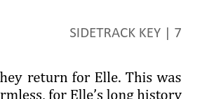
Chapters – just like with No Name Key, we wanted the book to look nice. At least as nice as a traditionally published book. Two of the easiest ways to do that are custom chapter headings, and a drop cap for the first letter of the first paragraph in a chapter. Here’s how it looks:
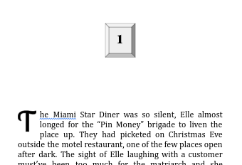
Each of these Chapter Numbers was created by hand as an image and inserted into the text. There are 45 chapters. Likewise the dropcaps were wordart in Google Docs using the Lobster 2 typeface. Remember that, it’ll come up when it’s time to do the epub. The chapter headings are reminiscent of old hotel room door numbers, and the dropcaps simliarly add to the 30’s deco/depression feel. Second to the cover, these tweaks give the book a unique look and feel.
All chapters start on the right side, with a blank page on the left side. Trees must die for this. This also means that chapters all start on odd-numbered pages. If the previous page ends on an odd-numbered page, well, you need to insert a section break, next page or two to get the pagination in sync. Of course when you add another page, everything after your newly inserted page may be out of whack. This is what makes this sort of editing so much fun.
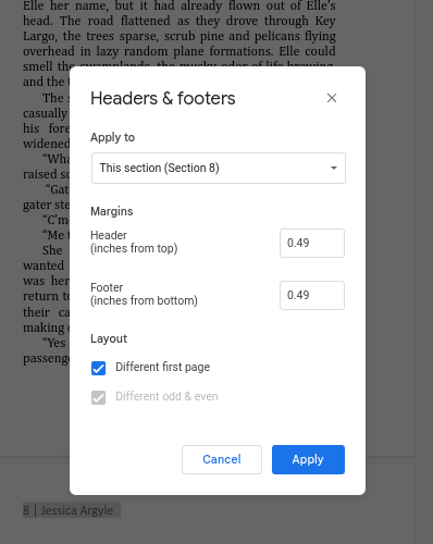
Page numbering – no page numbers on Chapter pages, or image pages. The first visible page number for Sidetrack Key is page 2. The Chapters have page headers, but they need to be suppressed, i.e. not printed. So pages are counted, but the header isn’t shown. This is a giant pain in the ass with Google Docs. Here’s the secret to suppress the header – click “Different first page”. You’ll need to insert new headers for each chapter and do this every time you want the header to vanish.
Attention to detail – Get out the tylenol and visine.
- All front matter starts at the same distance from the top of the page.
- Chapter headings and images start at the same distance from the top of the page.
- All non-chapter page text starts at the same distance from the top of the page
- Page numbers are equidistant from the book edges on left and right
- Text headings like “Epilogue”, “Acknowledgements’ are at the same level
At this point, you can Print to PDF, review it, upload it to KDP, fill in all the forms, and press the button and order a Proof Copy. Ours arrived in about 7 days.
And I found 3 issues.
The title page was higher than the text on the author page by about one line.
Somehow the text on the left-hand pages wasn’t aligned with the right-hand pages. Turns out there was an extra newline after the heading on the left side.
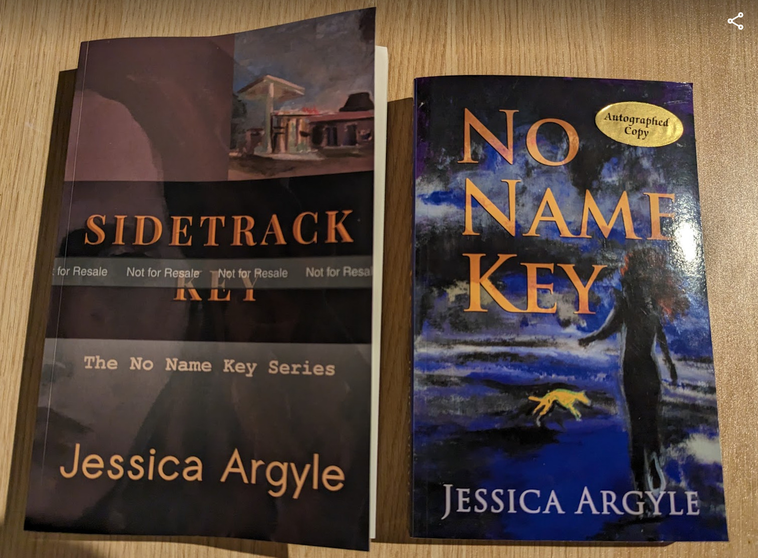
They’re not the same size. I chose 6×9 without checking what we used for No Name Key (5 1/2 x 8 1/2). That’s not very series-like. But we discovered we like the 6×9 format better, with the slightly larger letters since we’re all getting older. So if you’re doing a series make sure you check the final print size!
I’m sure there are more errors. There are always more.
If you made it through Part 2… now read for Part 3… the epub adventure.


Terrific info for good self-publishing – details matter! It’s also presented in a clear way so that we can follow and understand. Great job.
Thank you Roz! We try.