Like everything else about producing a novel, information is abundant, confusing and often contradictory. There are no end of experts, all with strong opinions, all willing to share information about every aspect of creating a book. After completing the inside, the cover is considered by many to be the single most important artistic decision.
Lets start with the basics – bits that everyone agrees upon: A book cover should be interesting in and of itself. Some are masterpieces of simplicity and accomplish much in one go – a favorite of mine is a line drawing of a single hanging naked light bulb on a stark white background. The book was called “Interrogation” – gorgeous, post-modern simplicity.
This works because book covers are no longer first seen full size. No longer do we browse lush establishments, with books arranged in pleasing geometric configurations, inviting the browser to reach out and touch, then handle the book, taking in the intricacies of quotations, background items, lingering over placement on the table. Finding books to read is an entirely different experience now.
Although we don’t have to stick to a simple singular image, the image we use does have to convey the mood or genre of the interior, acting as a gateway to the reading experience. So getting it as close to a simple singular mood and idea certainly is a safe bet. The hanging light bulb is a natural – the bulb could denote an idea or brainstorm, but the fact that it is hanging suggests something more sinister. Well done, but not the only game in town.
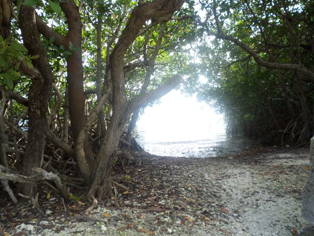
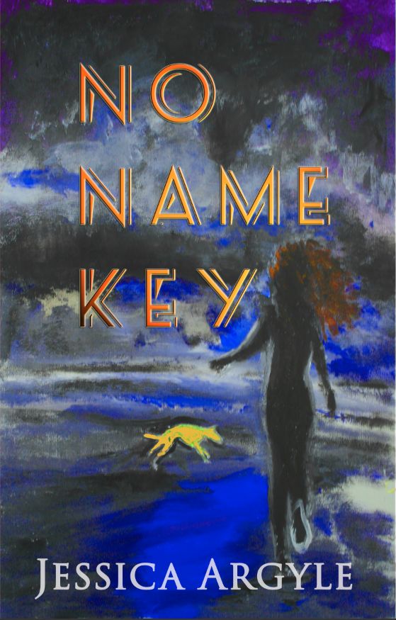
Many covers use photographs but to me these always seem generic, home made as opposed to handcrafted. Photos are available cheaply or you can always take your own for free. My current cover actually uses a photo of an everglade that I took on No Name Key – superimposed to the right of the watercolor image I painted of Elle. Sean positioned it to appear strategically around her head. To my eye, it looks like a crown of thorns.

But because books are now viewed in almost microscopic dimensions, we must court the thumbnail image now; unravel its mysteries. How do we convey the beauty and wonder of our story in a space this size:
Worse, hidden amongst row upon row of other thumbnails all clamoring for attention?
Because the thumbnail is the lure.
Here’s the process, as explained by Sean, who actually created the cover.
What I learned publishing No Name Key – part 2 – The Cover.
So although I love the current cover of No Name Key, I think it is too touchy-feely for the contents of the novel. I need more menace, so I started by changing the color.
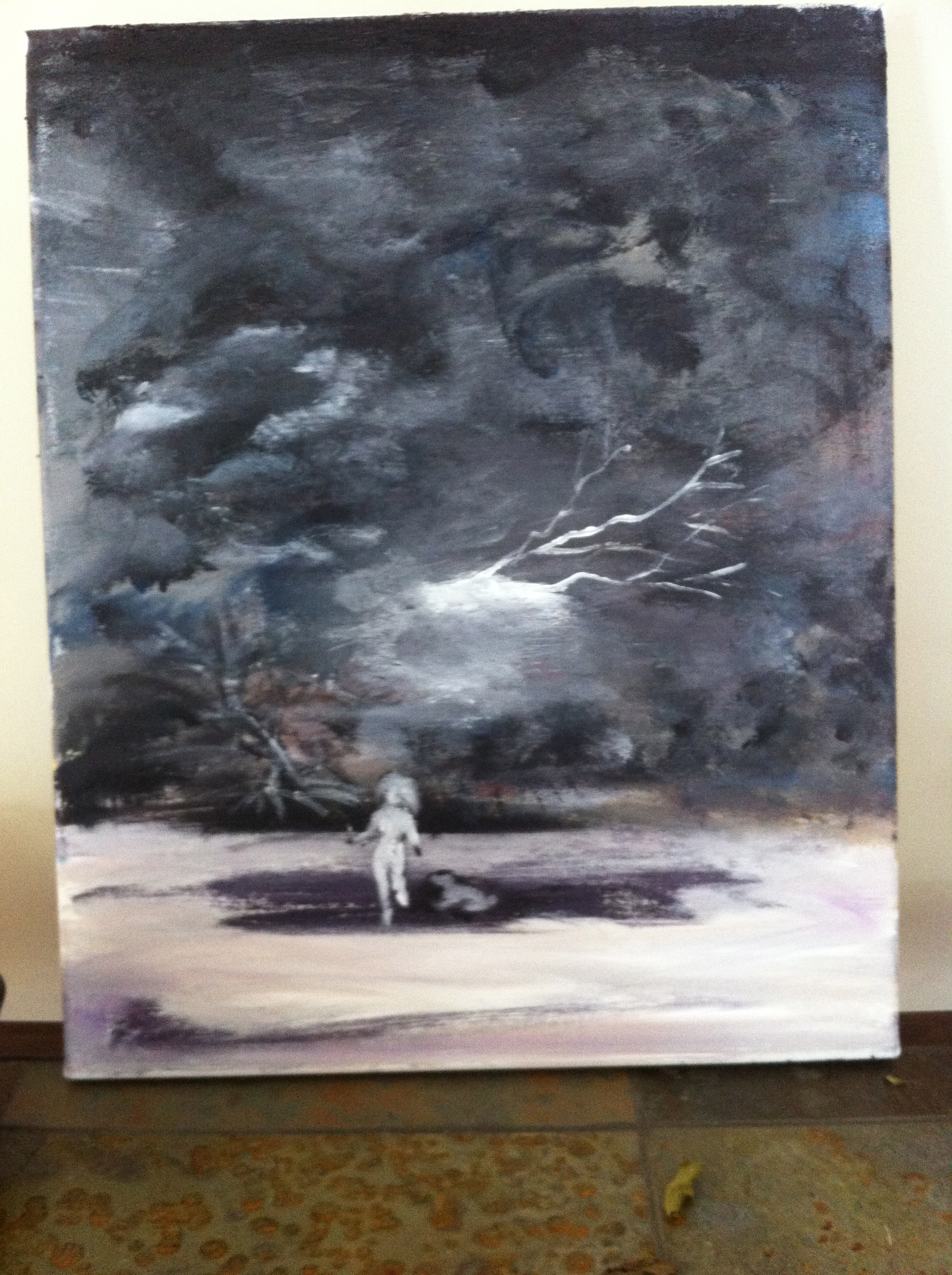
Black & White – I love the clouds and they also provide an opportunity to place the title but after reflecting, they were a little too nebulous and gray – the figure of the woman and the dog too small and would completely disappear in a thumbnail.
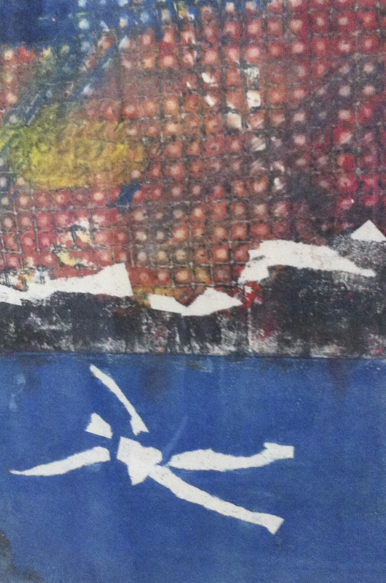
This came very close. My sister made this piece and I am saving it for another work. It is just too modern for a novel set in the Great depression. I so wanted to use this one. it has everything going for it, space for lettering, mystery, intrigue….damn.
Then I painted this piece – I like the mood – Okay so the hair is a bit much – but I could have changed that easily…

Then finally I made this – which I am going to use. 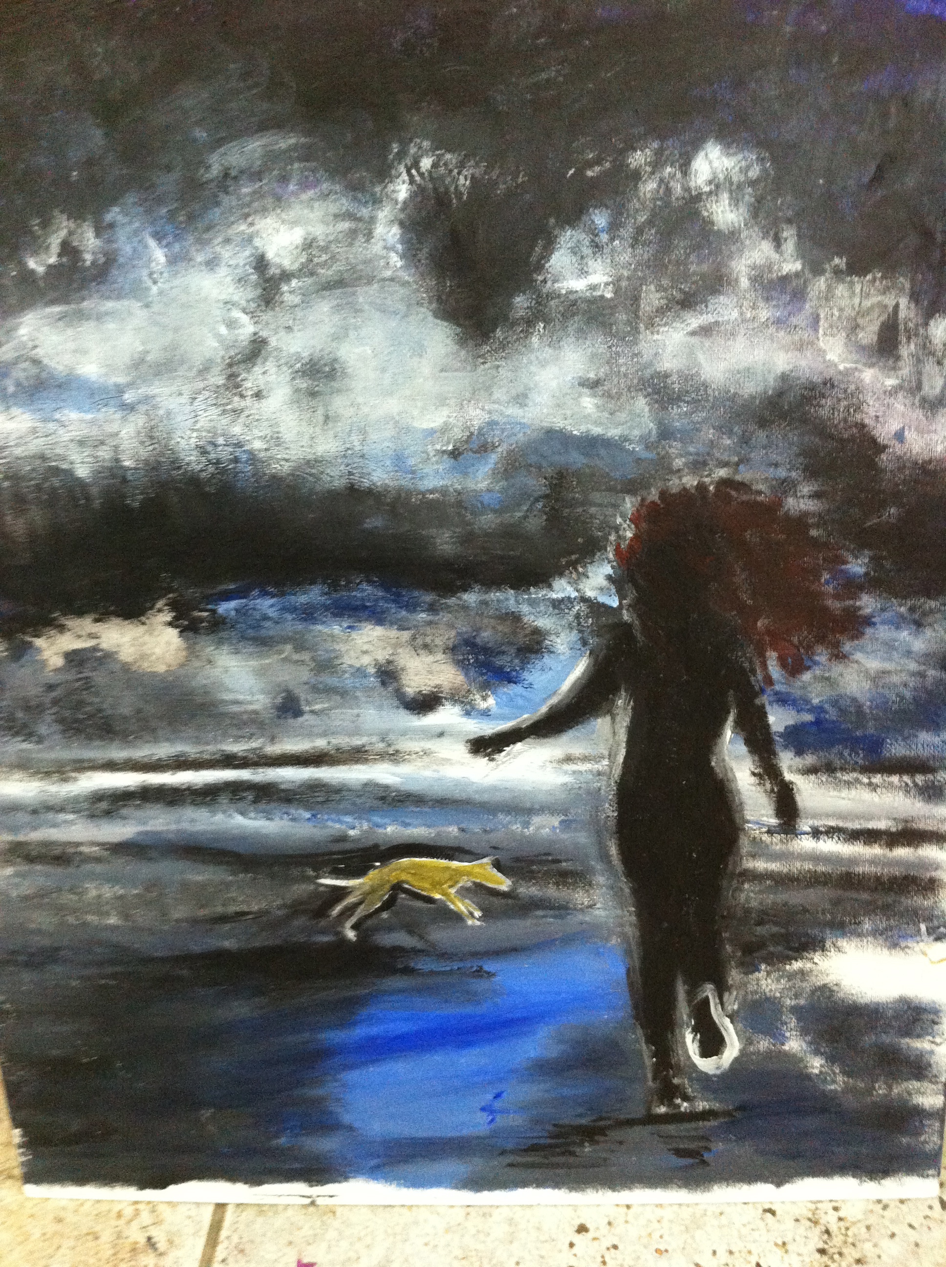
So after much agony, this is what happened after Sean got his hands on it.
It’s never easy finding the visual shorthand to convey an overall feeling about all those words in between the two covers. I understand the challenge you faced. There are so many variables once you really get into it too: final colour, contrast, size, fonts and their style colour and placement. It’s is easy to second guess everything. I think you and Sean made good choices here. It’s really not easy!