
This isn’t Jessica. This is Sean MacGuire, husband and publisher of Sidetrack Key. I get to do the interesting work of getting the book out the door looking presentable. I also agreed to write a few words about the process, hoping it might help others in a similar situation.
Our goal is to produce a book that’s of higher quality than those traditionally published.
Let’s start with the title.
When Amazon arrived, the publishing world changed, and it’s been changing fast. One of the trends we noticed at the start is how people browse and scan titles. In other words, how they buy.
The title needs to be searchable and relatively unique.
That sounds sort of obvious, right? Well, what if we named it Midnight?
Search for that on Amazon: 1-16 of over 50,000 results for “midnight”. Google comes back with About 1,670,000,000 results. Great title if you never want to be found.
Search for your potential title names on Google and Amazon first. Make your title easy to find. Choose wisely.
“Piners” was a possibility, because the locals on Big Pine call themselves piners… and it implies pining, which is an interesting image… anyhow – Sidetrack Key ended up being the name. Since this is the second book in the No Name Key series, might as well stick with the Keys motif, and it’s the name of Elle’s diner.
Next, the cover. In some ways, it’s the easiest, in other ways the hardest, and a pretty important part of the book. The cover provides a quick summary of the book, the mood, and what it’s about. Jessica usually paints her cover. Using a painting for a cover, or any photo as a background is a challenge.
Challenge: The cover needs to be legible as a tiny Amazon thumbnail.

Of the 4 titles shown above, only Annie Dillard’s book gets it right for digital sales. Both the title and author names are legible. Legible isn’t a high bar. If I can’t see it, I’m probably not going to buy it. And once you’re aware of this extraordinary change in cover design, everything changes.
So Jessica wants to use 2 of her paintings for the cover, and we have to make it legible, emotive,without destroying the art How the hell. Here are the paintings. Go!
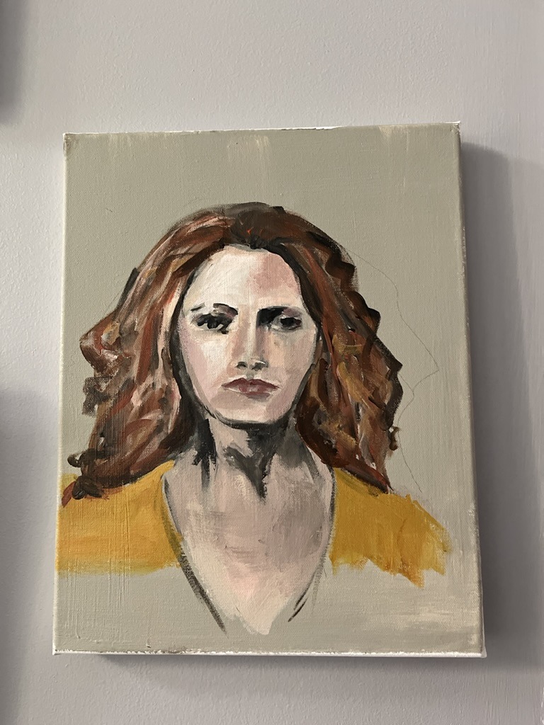
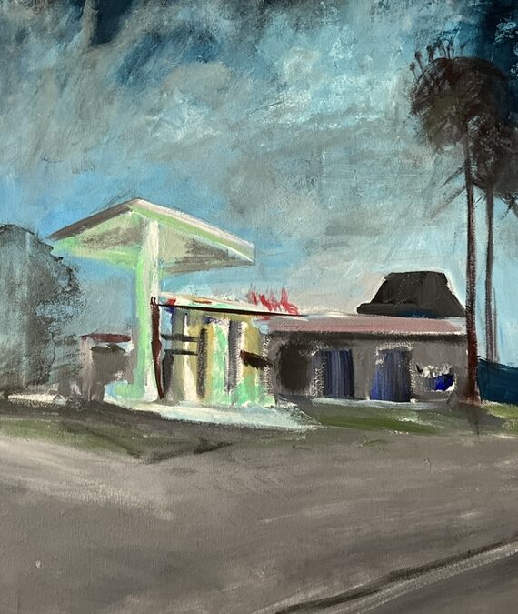
Well, looking at those pictures, it’s probably not going to be a lighthearted romance.
Now it’s fiddling around time. How to arrange those into a cover. An early attempt here, there were lots of them. Jessica didn’t appreciate the blue tint I added to give the cover more contrast. Her name is invisible. Vertical text isn’t a good idea, but the color stands out at least and the 2 paintings are justaposed well – Elle could be leaving the diner, thinking about the diner…
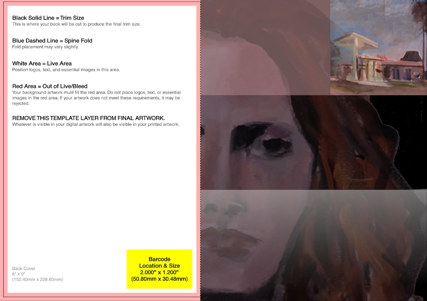
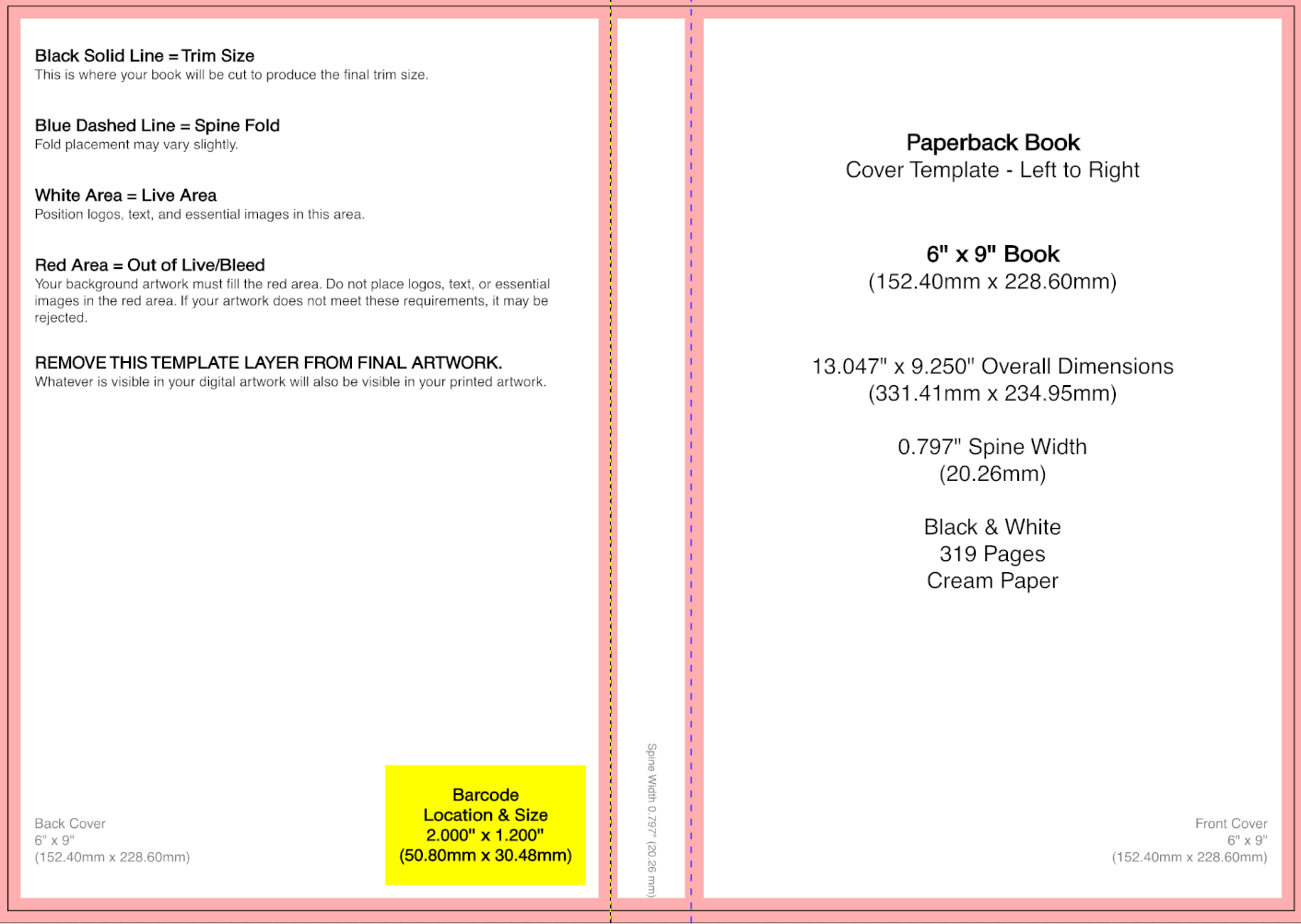
We have another pretty esoteric problem. We need 2 covers, one for the Kindle version which uses a 1.6:1 proportions (2560×1600 pixels), and a physical book (6″x9″) with a spine whose width is proportional to the verbosity of the author. Hint: wide spine incoming.
Easiest place to start is the Amazon book template which looks like this. I didn’t. You can.
Here’s what the background ended up as. Note that the face extends over the spine of the book, so if you lay it flat, you’ll see more of her face.
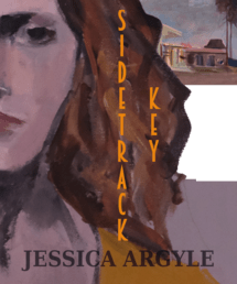
Next – the text. The font of the title is incredibly important, it should convey the feel of the book. Sidetrack Key is set in the ‘WPA era of the 30’s, so I looked for a font and color that would fit. This is the end result after downloading pretty well every font ever created.
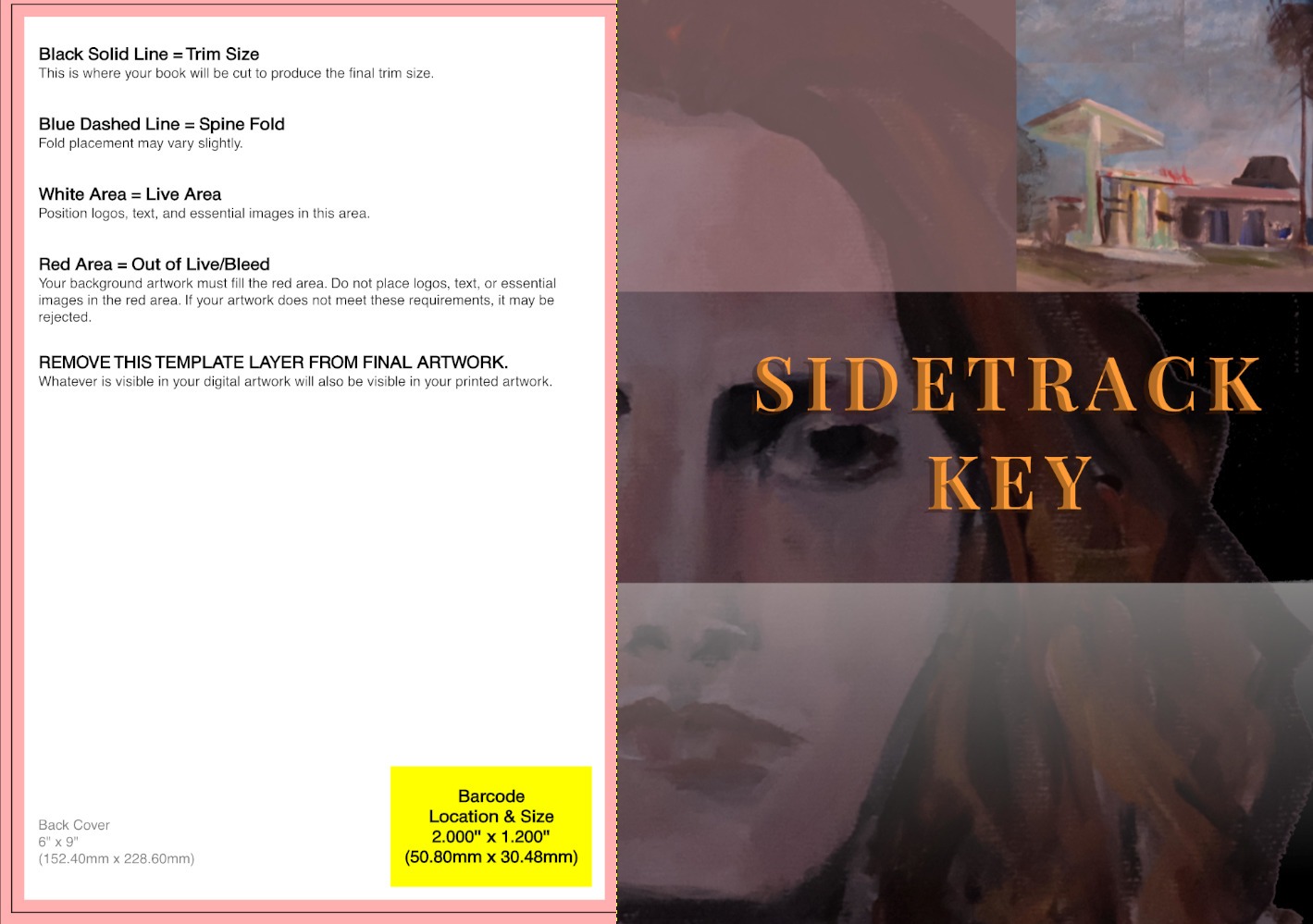
Now just add the author’s name and the rest of the front… so, large name and high contrast. The font for the series isn’t that important, so it’s sort of faded into the background. Also – minimize the number of fonts, too many are distracting, unless that’s the look you’re after. It shouldn’t be.
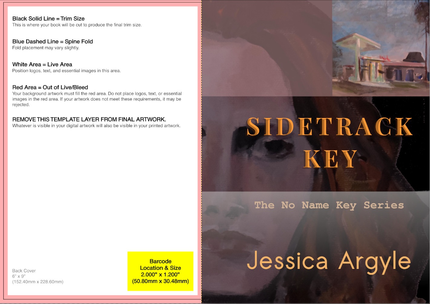
Time for a sanity check. How does it look as a thumbnail? Not bad. The title, and name are visible without a magnifying glass, and the face unexpectedly shines through. Note that many authors use all caps for their names – it’s an easy size and contrast win. I probably should have. And the beauty of digital it it can be changed relatively easily.
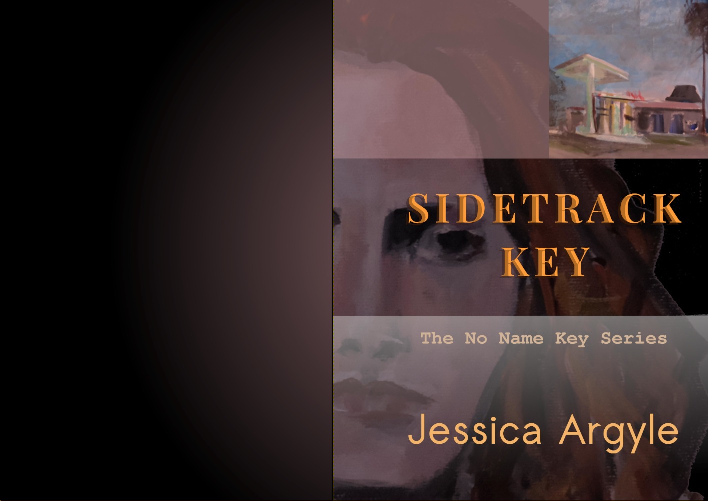
Now the back. Easy enough if you just choose a single color for a background, sort of. Same issues of visibility and contrast, plus it would be nice if it enhanced the front. Instead, I did this… faded the face color onto the back so it’s like her shadow self. Will anyone notice? Well, now that I mentioned it, I certainly hope so.
Finally, add text for the spine, same font as the title without the effects, same color as the author name, and add the author name in the same color as the “No Name Key Series” text. Again I wanted to limit the number of fonts and colors and keep everything more or less in the same palate.
The back matter has summary title, summary text, and blurbs, using colors to distinguish the type of information.

Finally, back to the esoteric problem of the kindle cover which is taller and thinner than the book. I ended up just cropping the front, which resulted in this, grabbed directly from the Amazon listing. We lose some of her nose and the palm tree in the upper right hand corner.

And it looks like it belongs to the same family as No Name Key.

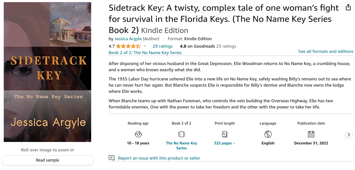
Here’s the listing for the Kindle version on Amazon. If you’ve read this far, buy the book and leave a review… just click the picture below.
Drop a note in the comments and let me know if you want more of the gory details of publishing these books.
Cover creation was done using free software running on Linux. GIMP was used as the image editor.

This is excellent. Love reading the process since I had no idea. Jessica’s artwork is stunning. Love the collaboration between husband and wife to create this fabulous cover.