Part 1 covered the title and Part 2 covered the print version of Sidetrack Key. I’ve saved the best for last, creating the epub/Kindle version.
In general, if you have a well-formatted manuscript – which means chapter headings as sections, correct paragraph spacing, and consistent fonts, then creating an epub can be pretty simple.
The front matter for the epub and print versions is a little different.
- The epub version doesn’t need the ISBN number in the colophon.
- FIRST EDITION becomes DIGITAL EDITION
- PRINTED IN THE USA should be removed
- You can add links to external sites, like this blog or the publisher
- The epub process will remove all the extra blank pages.
Then you need to decide how closely you want the digital version to resemble the print version. If you haven’t used specialized fonts for the title, or any special graphics or dropcaps, you might be able to go straight to an epub version with almost no pain.
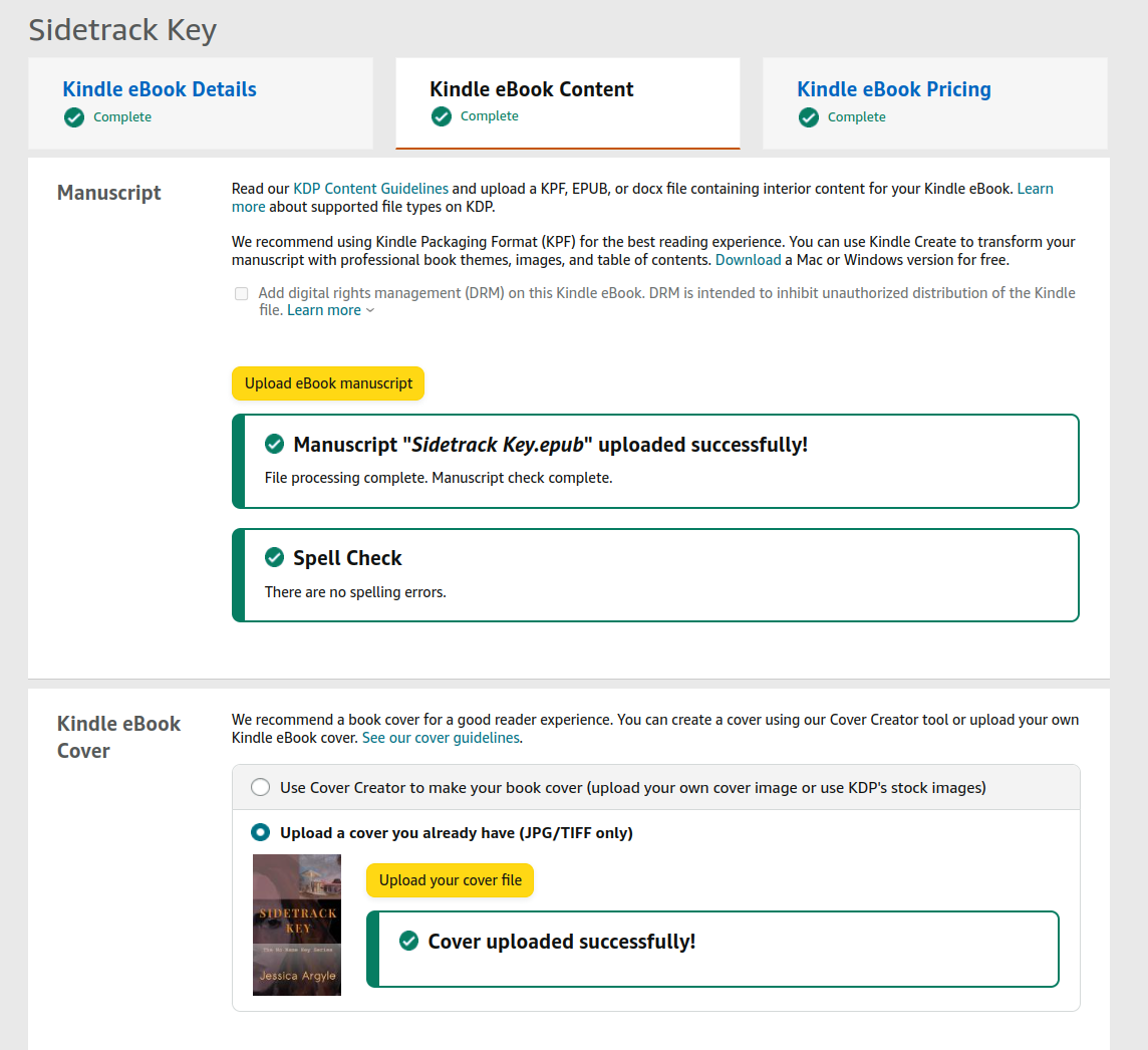
If you’re planning to sell on Amazon, then go to Amazon KDP Select – upload your manuscript in Word or epub format, they’ll spell check it and check for formatting errors, then you can preview the results right there. If it looks good, you’re done!
When I first tried this on the print version of Sidetrack Key it became clear that there was going to be some work to do.
- The fonts for the title were completely different – epubs by default use a set of standard fonts and ours wasn’t included.
- The Chapter heading graphics were HUGE, like massive badges that took up 1/4 of a kindle page. This makes sense if you think about the print version being X number of pixels and then you use those same X number of pixels on a much smaller screen, well the resulting graphic gets much bigger.
- The dropcaps were mangled beyond recognition. They could have been a bad man from one of Jessica’s stories they were so beat up.
If this sort of thing happens to you, there are essentially 3 choices. The first is go back to your manuscript in Word or Google Docs and remove the offending elements. Put in regular numbers for chapter headings and forget about things like drop caps. Ditto the fonts – accept what you’re given, get rid of the stuff that doesn’t work, and you’ll have a perfectly acceptable epub.
The second choice is to see if the broken things can be fixed. At this point if you’re not comfortable with HTML and webpages, try using something like Kindle Create (it’s free) – it will take your Word document and allow you to make changes and create a document suitable for uploading to Amazon. The formatting options are somewhat limited, but you’ll be able to add images and change fonts and dropcaps. This is probably the best solution for 90% of the people publishing a Kindle version.
The third choice is dive into the guts of an epub document and make the changes to it directly.
There’s a 4th choice as well. Pay someone else to do it. There are services out there that do a good job at a fair price, and a pile of cheap services available on fiverr.
There’s nothing magic about an epub document. All it is is a zip file that contains what is essentially a webpage (technically an xhtml document). If you want to take a peek inside of one, change the .epub extension to .zip and unzip it and Voila! there’s your doc.
I took a crack using Kindle create but decided to edit the epub directly. There are 2 good, free tools available for this:
- Calibre – is an e-book management tool with an interface straight from 1995
- Sigil and PageEdit – Sigil is a web-code editor that displays your epub, and PageEdit is a full editor
Note I didn’t see PageEdit as an option with Sigil and I’d try that first to see if it does everything you need it to. I suspect I could have saved myself a lot of pain if I’d seen this before just now.
I used Calibre. Calibre will manage all your ebooks and allow you to edit them. By edit I mean it’ll allow you to edit the HTML code and display the results in a different window. This is a pretty unpleasant experience and I wouldn’t recommend it. However – should you choose this route I’ve got some guidelines below. They apply to the formatting of any epub in general.
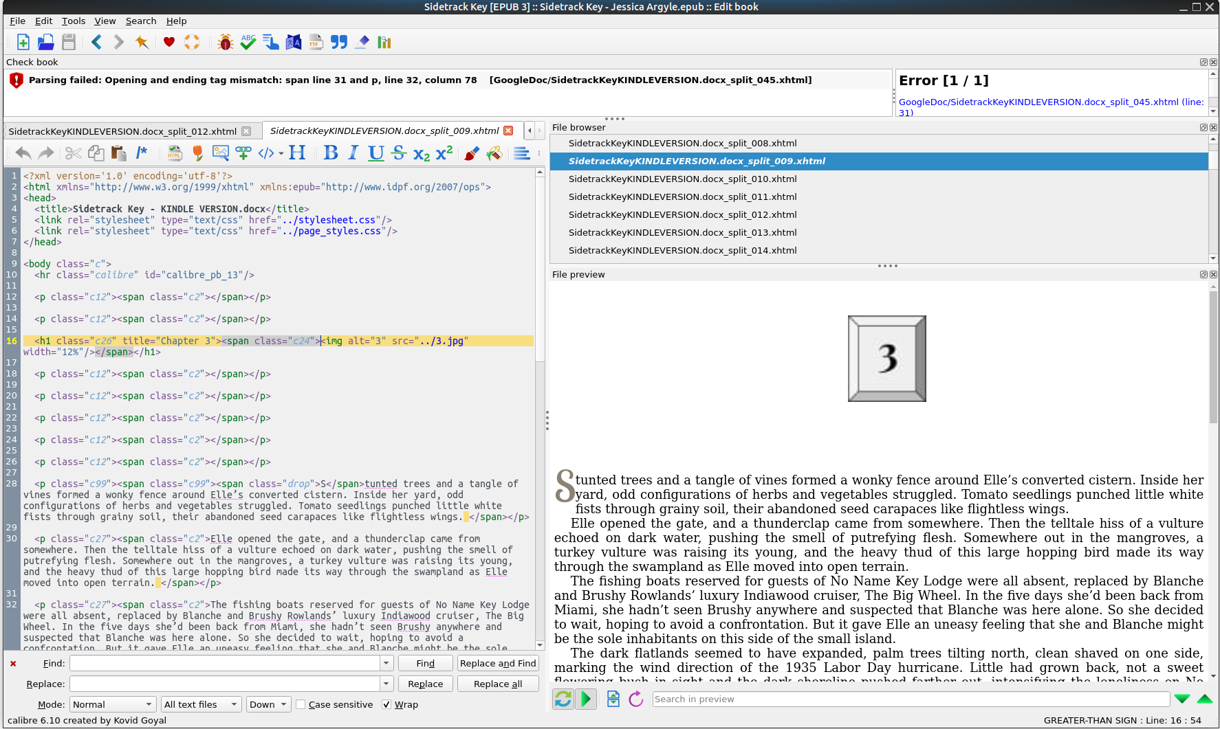
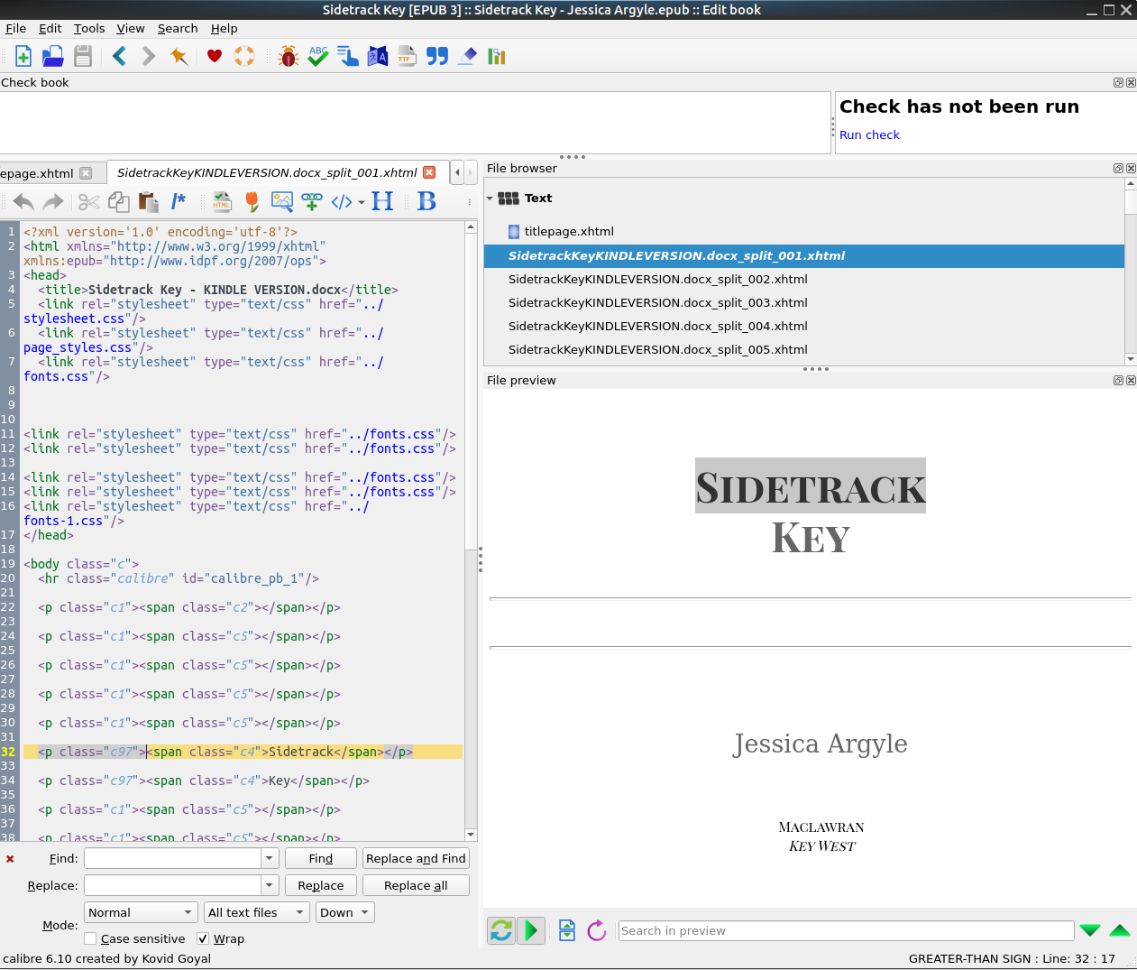
Hit edit and get this confusing mess. Each chapter is it’s own file – that blue line in the screen capture below. On the left is the HTML that creates the page that’s shown on the right. You don’t edit the page on the right, that’s just the display, you edit the code on the left, in HTML. The yellow line is pointing at the graphic that was inserted for the heading of Chapter 3. It’s not for the faint of heart, and it’s awkward. But it works.
The tricks used here were:
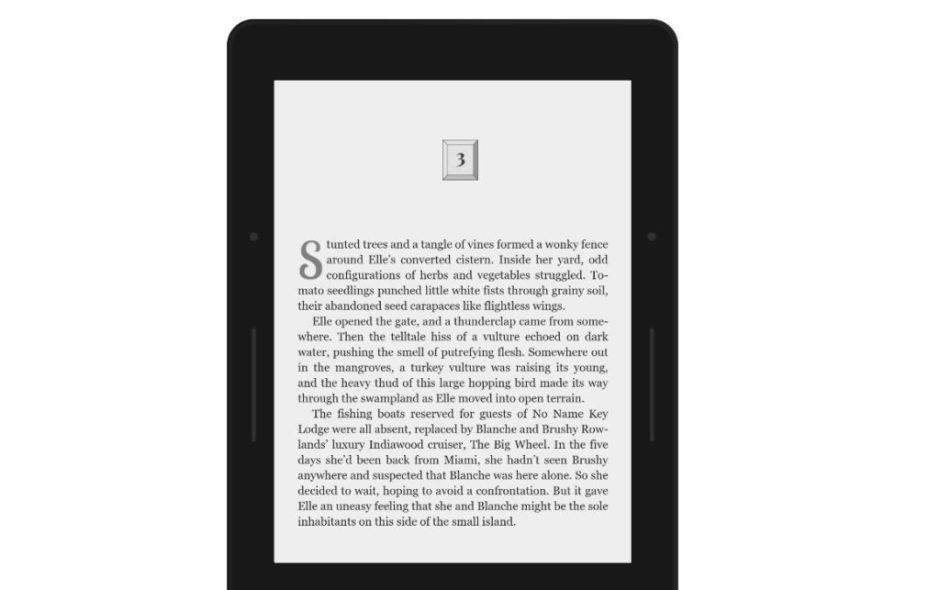
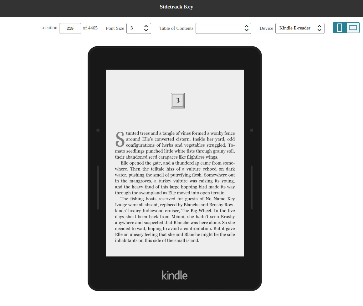
Chapter headings. Each was an image like this. The problem was that e-readers vary tremendously. Kindle on my Pixel 6 Pro is much taller than on Jessica’s Voyage. They have different resolutions, some support color, etc. So what looks good on one (my phone) may become gigantic on another (Jessica’s kindle). The trick is to set the width to be a percentage of the width of the device. 12% worked well for me.
<img alt="3" src="../3.jpg" width="12%"/>The above code basically says “use the image file 3.jpg with a width of 12% and (alt) display a 3 if you can’t display the image”.
Drop caps. Whereas the print document using Google Docs was happy to use Word art and produced nice results, the graphics it produced were just little black squares when ingested by the Kindle, so they all had to go. They were replaced by some CSS for the font, size and location. So the S in the first line of Chapter 3 above ends up looking like this in code:
<span class="drop">S</span>tunted treesAll HTML formatting is surrounded by matching brackets. In this case a span containing only the letter S is to be displayed using the CSS formatting described by the drop class. That CSS class named drop looks like this:
.drop {
  float: left;
  font-family: "Lobster Two";
  font-weight: 400;
  margin-left: 0;
  font-size: 350%;
  margin-top: -0.3em;
  margin-right: 0;
  color: #8C8273;
}
This basically says “I want the character to be in the Lobster Two” font, medium weight (400), 3.5x the size of the font on the rest of the sentence, about 1/3 of a line down from the top and sort of grey #8C8273 is the color below.
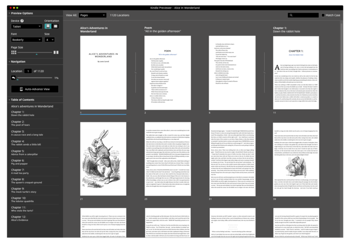
The KDP preview on Amazon is great, lets you see what your epub will look like on a phone, tablet, or a kindle. Here’s what Chapter 3 looks like on a Kindle. The dropcap is a little bigger in the epub, but I think it looks nice. This gives the epub version the same look and feel as the print version.
Fonts. I needed to choose a font and make it available for use in the epub. This wasn’t immediately obvious exactly how this was done.
First, you need a copy of the fonts you want to use. In our case there were 2 main extra fonts, Lobster 2 for the dropcaps and Playfair Display SC for the titles. Choose your fonts and download a .ttf file from Google fonts, or your favorite font place. Do be sure to check the license to make sure you’re allowed to use them for free.
Next, you’ll need to install these fonts on your system, or at least know where you downloaded them.
I’ve highlighted the word SIDETRACK since that needs to be in Playfair Display. The editor on the left is pointing to the line in the epub that displays that line. Similar to the dropcaps, the important code looks like this:
<span class="c4">Sidetrack</span>This basically says “Display the word SIDETRACK” using whatever the CSS for class c4 looks like.
The CSS for class c4 looks like this:
.c4 {
  color: #666;
  font-family: "Playfair Display SC";
  font-size: 1.5em;
  font-style: normal;
  font-weight: 700;
  line-height: 1.2;
  text-decoration: none;
  vertical-align: baseline;
}
This basically says “Display whatever with the color grey (666), the font Playfair Display SC, 1.5x the usual font size, and bold”.
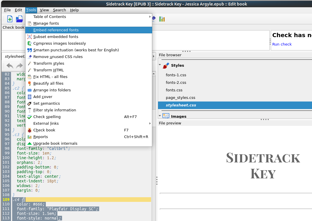
I did that and it didn’t work. One last step. I had to tell Calibre to install and use the fonts. If you don’t include a copy of your special fonts in the epub document, you’ll get whatever the default Kindle uses instead. Click “Embed referenced fonts” and you should be good to go.
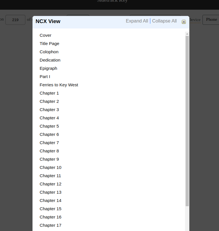
The final bit of customization had to do with the generation of a Table of Contents. Amazon will do a fair job of creating a table of contents provided you consistently used Sections in your manuscript. Calibre can generate a table of contents (also known as an NCX Table of Contents) which you can customize.
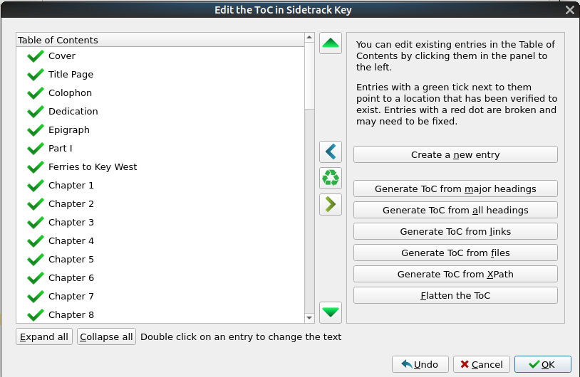
I added links to the front matter, the ferry schedule, and everything else important in the book. The table of contents appeared correctly using the Kindle Preview NCX view.
The last step is proofreading your epub version.
Save your epub. It’ll have the extension “epub”. You can now view this file on a Kindle or other e-reader.
Amazon has a Kindle viewer that’s free to download and use.
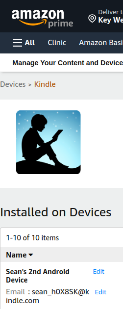
You can also email it to your kindle. It helps to see it on your own kindle, even better if you have more than one to test with. Every kindle has an email address associated with it. They don’t make it easy to find, Login, Click on “Accounts and Lists” and choose “Content and Devices”, then choose your Kindle device. The email will be listed there, usually yourname_XXXXX@kindle.com
Send an email to your kindle using that email address with your epub as an attachment. It will usually appear within a couple of minutes.
Congratulations, you’ve published to your own Kindle!
The conversion process may add extra formatting changes. In our case sometimes a word would appear to have an extra space or newline inserted somewhere odd. It would mean going back into the epub and fixing it and saving it again, and emailing the results back to your kindle. Painful and painstaking.
Once you’re satisfied with the results, or completely sick of the process, it’s time to upload your epub to KDP. Upload it, press the button, see what the Amazon Kindle Previewer thinks it looks like, and if you’re happy, you’re done.
Final note – the beauty of an epub document is that you can make corrections and re-upload the fixed version as many times as you need to, so don’t panic, it’s not print.
If you have any questions about the process, drop a note in the comments and I’ll be happy to try to answer you.
But wait, there’s more!
The Epilogue – where we discover AI may be being used for nefarious purposes.